DTech Website
Duke Code+ Internship Program, Summer 2020
I am currently working as a product manager intern on a two-student team in the Duke OIT Code+ internship program, delivering a new website for the Duke Technology Scholars Program (DTech)—an organization that inspires and supports women in tech. Taking on the PM and development responsibilities while my partner, Olivia, is mainly responsible for UX/UI, I have learned an incredible amount about what it takes to breathe life into a B2C product and how a product team can work together best for a customer-oriented focus.
Motivation
The Duke Technology Scholars Program needs a new and updated website that maximizes user engagement and improves upon the design and user flow of the current website.
Before Code+ began, Olivia and I had already met several times with our two stakeholders: the DTech executive director and program coordinator. Through these meetings, we established user groups and overall goals for the project:
User Groups
-
Scholars & associates (student members)
-
Companies
-
Stakeholders
-
General Duke community
Goals
-
To provide consolidated career resources for DTech members
-
To deliver an updated look and feel that improves upon the old website
-
To give back to the Duke community

Currently existing site
User Research
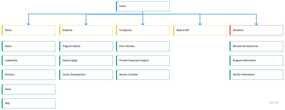
With the limited time of the 10-week program, I prioritized the research and feedback into a spreadsheet that listed "must-have" and "nice-to-have" functionalities. Once I had a spec written up for the overarching framework of the project, I managed extensive user research, including finding similar websites to our goal and conducting user interviews. One of the biggest points of discussion throughout the site navigation and how to organize all of the content that we wanted on the site, including a Shibboleth-protected private-facing section of the site for member-specific resources, resulting in the site map below:
Wireframing
With our site map and content mapped out, my partner and I collaborated on designing wireframes in Figma. One of our main constraints in the UI was adhering to the Duke Brand Guide, and in correlation with the Duke site ecosystem, we designed wireframes that encompass a minimalist and professional style, simultaneously taking advantage of the DTech organization photos available. The wireframe below does not include "Members" in the navigation because it is only visible when the user is logged in.


Homepage, without being logged in
Documents & Profiles tabbed page (private section)
Final Result
With Olivia having focused on designing wireframes, I took on the development role. Going into the development phase, I planned out functional requirements as well as a spreadsheet of content types and paragraph bundles (Drupal 8 terminology for component-like structures) necessary for Drupal 8 implementation. Along the way, I have learned ReactJS and how to query using GraphiQL quickly on the job, and have now finished coding almost all paragraph bundles. A locally hosted test page below shows some of the components I have completed, taking into account querying optional fields, which paragraph bundles are referenced within others, and React styling features. Our final result is a beautifully designed, easy to navigate, refreshed website for a thriving community at Duke, with some example pages shown above.